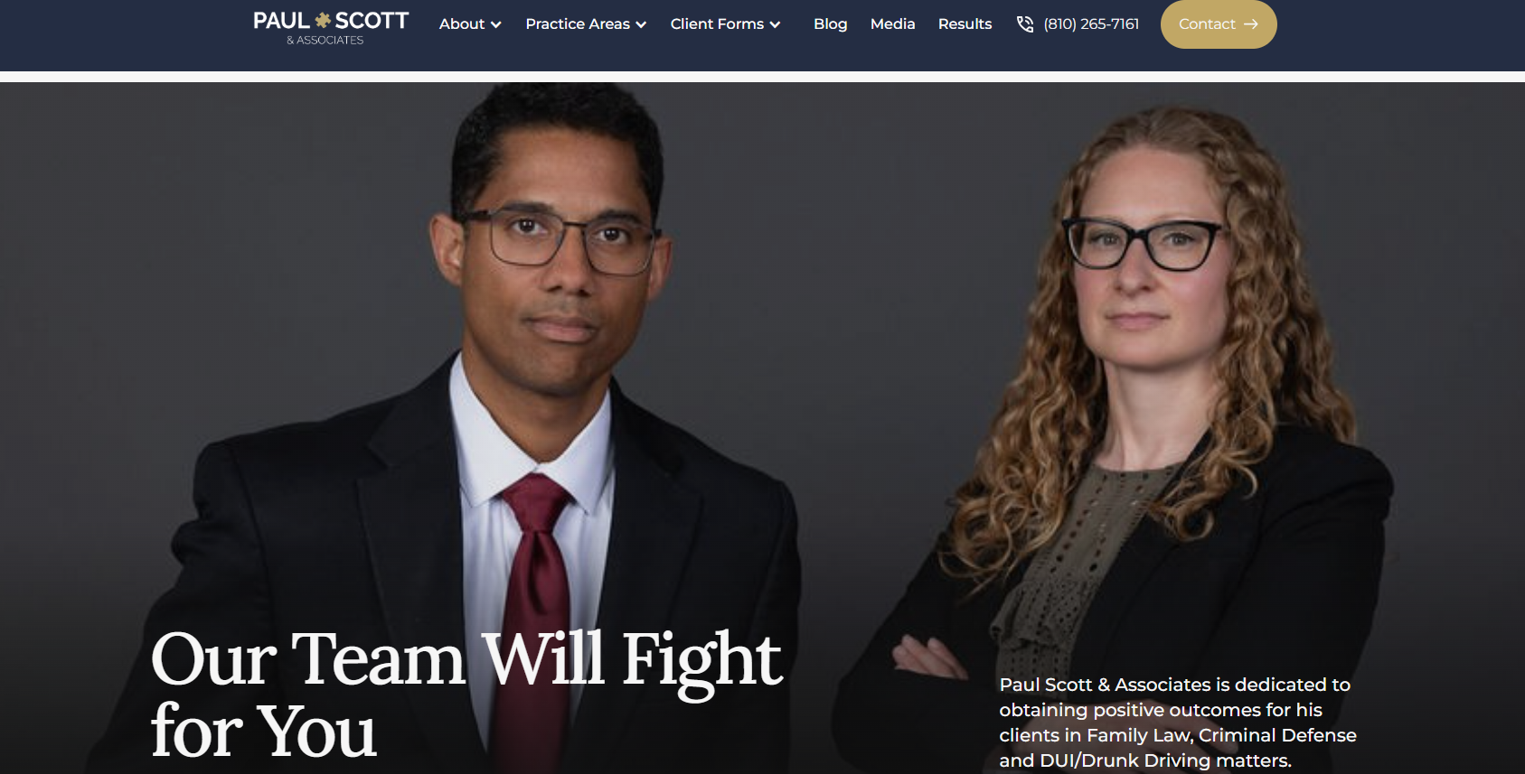
Project Details
When I joined the project, the firm’s previous website was no longer supported by the web company that built it. The live site had also been affected by fraudulent code, so it was not reliable enough to use as the primary source for the redesign. This created an urgent need to recover key information and launch a stable replacement quickly.
Project Goals
- Recover essential attorney, practice-area, contact, and client-form content.
- Make client intake forms easier to locate and complete.
- Reduce visual clutter and make important next steps more visible on the homepage.
- Preserve the firm’s familiar branding while making the site feel more current.
- Create a website that worked reliably across desktop and mobile devices.
- Launch a functional replacement within roughly one month.
Project Constraints
- The prior website could not be relied on for content recovery because its content had been compromised.
- A small number of original PDF documents could not be recovered.
- The launch timeline was short: work began in early May and the new website launched in early June.
- The website needed to preserve an established firm identity rather than introduce a completely new brand or visual direction.
- Some Webflow layout and CMS behavior required further refinement after launch, particularly on mobile screens.
Things I Did
Recovered the site’s content
Because the live site was unreliable, I used the Wayback Machine to locate archived versions of the previous website. I recovered approximately 95% of the original content, including attorney bios, practice-area information, contact content and client forms.
I used that recovery work as the starting point for the new site. Rather than transferring pages exactly as they appeared before, I reviewed how the content was organized and decided which information needed a clearer place in the navigation or a simpler structure.
Chose Webflow for the rebuild
I researched CMS options and selected Webflow because it could support a polished, responsive website, allow the firm to manage content moving forward and be built within the project’s short timeframe.
This was one of my first substantial Webflow projects. I learned how its CMS collections, classes, layers and responsive controls affected the final site while building it. Starting from an existing structure helped me launch quickly, but I heavily customized it to fit the firm’s content, style and needs.
Reorganized high-priority information
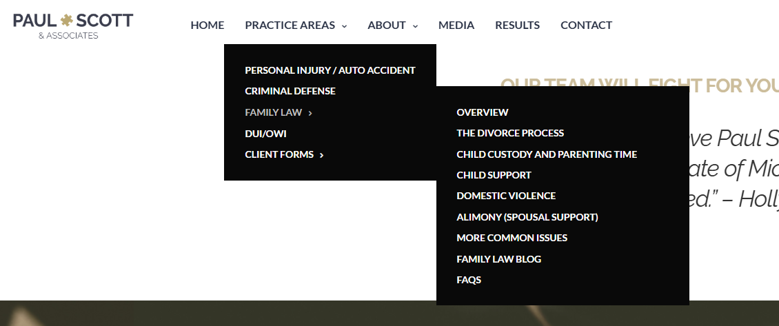
I focused the navigation around the pages visitors were most likely to need: attorney bios, legal services, client forms and ways to contact the firm.
- Moved client intake forms out of the Practice Areas section and into their own primary navigation item so prospective clients could find them more easily.
- Combined the Family Law FAQs with the main Family Law page so visitors could find answers without moving between closely related pages.
- Moved supplementary Family Law content into the blog, keeping the primary practice-area page more focused and easier to scan.
- Simplified the main navigation to reduce competing links and give key visitor tasks a clearer path.

Refined the visual experience
I kept the firm’s existing style direction so the redesigned website would still feel familiar to returning clients. I refined the font choices to better match the firm’s tone and reduced visual clutter on the homepage so the most important information and actions stood out.
I initially used stock imagery to meet the launch timeline, then replaced it with updated attorney headshots once the client provided them. This gave the final site a more personal and credible feel while allowing the firm to launch quickly.
Improved calls to action
I reviewed the homepage and key pages to make next steps more visible for visitors who wanted to contact the firm or begin an intake form. The goal was to reduce the amount of searching someone needed to do before taking action.
Continued refining the site after launch
The site launched on time, but I continued revisiting parts of the build after launch. The most challenging area was responsive behavior: Webflow’s classes, nested elements, layout rules, and size settings could create unintended results at different screen widths.
I spent time correcting those issues and learning how to build more consistent responsive layouts. I am also continuing to learn how CMS fields populate different components so future updates are easier to manage and remain consistent.
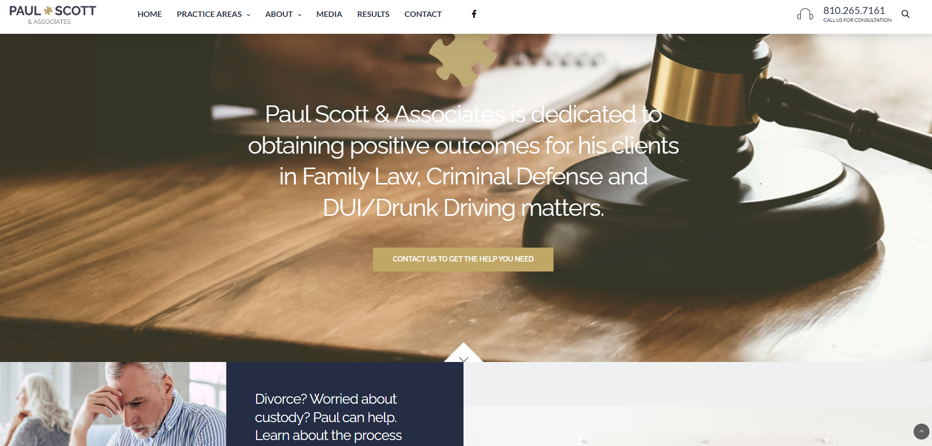
Below is a screenshot of the previous instance of the website. To see an interactive version of the other pages of the old website, visit the WayBack Machine.
No items found.
Related Works
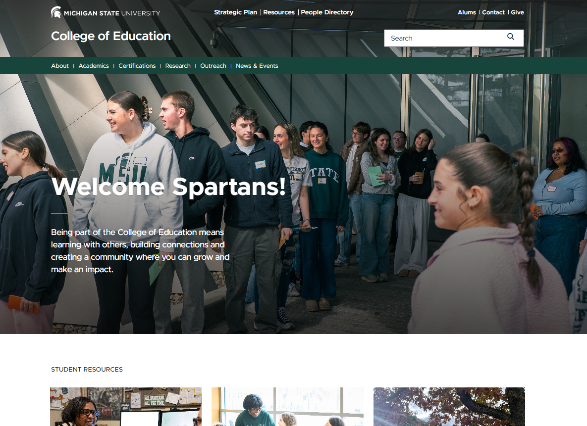
MSU College of Education Website
The MSU College of Education website serves as a central resource for current and prospective students, faculty and staff with academic programs, research, events, resources and more.
View Case Study
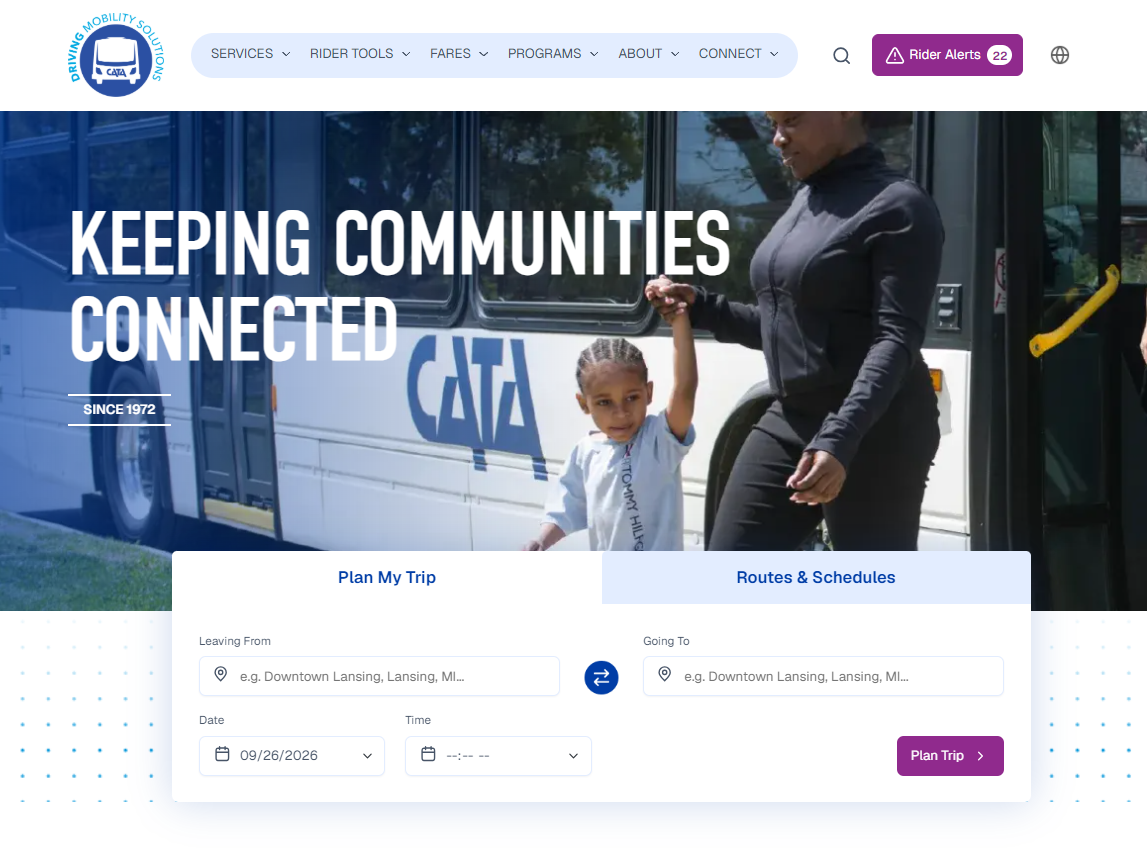
Capital Area Transportation Authority (CATA) Website
The CATA website is a central resource for transit around the Greater Lansing and surrounding areas (including MSU). Riders can plan trips, view routes and schedules, pay fares, receive service alerts and access the information and tools they need to navigate the public transportation system.
View Case Study

