A large-scale content migration
When the project began, the College of Education had more than 25,000 legacy WordPress URLs, including people, news, event, program and informational pages. Moving to Sitecore XM Cloud gave us the opportunity to reduce clutter, improve findability and create a more maintainable website—while allowing MSU IT to support more of the technical platform needs and our team to focus on content and user experience.
Lauren began developing the site tracker and coordinating with key college stakeholders during the project’s discovery phase. When she went on maternity leave, I took over much of the active tracker review and content-preparation work, reviewing an estimated 5,000–7,000 URLs and collaborating with subject-matter experts to prepare content for migration.
Content decisions, not copy-and-paste
Each URL was evaluated before migration. Rather than treating the work as a straight content transfer, we used a content-strategy approach to determine whether information should move forward, be improved, be combined with related content, be redirected, or be retired.
Questions that guided each decision
- Is this content still accurate, useful and needed?
- Does it need updates before it is published on the new site?
- Can dense or wordy information be made clearer and easier to scan online?
- Could similar pages be combined to reduce unnecessary content?
- Is a low-traffic page underperforming because the content is not useful, difficult to find, or no longer needed?
- Can the URL and page structure be simplified to support clearer navigation and stronger search visibility?
This approach helped reduce a large legacy collection of nested and overlapping content into a more focused, usable and search-friendly web experience.
Program-page evolution
Academic program pages were a high-priority part of the migration because they support prospective students looking for requirements, application details, concentrations, accreditation information and next steps.
Lauren and I worked with UCAM and RDA to define the program-page and side-navigation templates. I worked directly with program directors and coordinators—leading work for most programs—to decide what information belonged in each section and ensure that content made sense within the new structure.
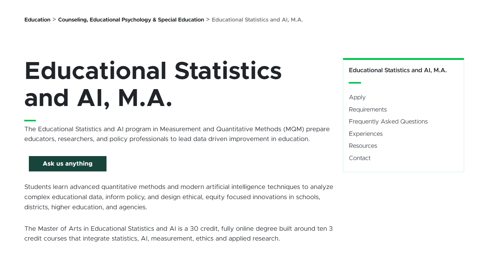
During development, the original side-tab concept created limitations for accessibility, page behavior and content flexibility. We shifted to a side-navigation model with dedicated URLs for key content areas, creating a more predictable experience for visitors and more flexibility for programs with unique accreditation requirements.
The program-page work remains ongoing. I am currently refining the layout by introducing a two-thirds-width opening section followed by full-width content areas, which creates more visual balance and space for information. I am also adding visual components, including landing-page imagery, to make program pages feel more engaging while keeping information easy to scan.
Things I Did
Co-managed the content audit and tracker
I co-managed the site tracker and content-audit process with my supervisor, then independently carried much of the work forward while she was on leave.
- Reviewed an estimated 5,000–7,000 URLs within a 25,000+ URL WordPress environment.
- Updated tracker records, page statuses, content needs and migration decisions.
- Made final content decisions after gathering and incorporating input from subject-matter experts.
- Reviewed pages for accuracy, relevance, duplication, readability and readiness for the new platform.
- Worked with stakeholders to update, consolidate, redirect, or retire content before launch.
Improved content structure and findability
I helped shift content away from long, deeply nested URLs and scattered, low-value pages toward clearer, more intentional structures.
- Recommended consolidating related content rather than maintaining multiple short, overlapping pages.
- Reduced wordy or outdated copy to make information easier to scan and understand online.
- Used website analytics to investigate low-performing pages and distinguish between content that was hidden, poorly structured, no longer needed, or in need of improvement.
- Helped create a cleaner site structure designed to support navigation, search visibility and long-term content maintenance.
Took ownership during a critical build phase
A few months into the role, I became the primary manager of the website mirgation while Lauren was on maternity leave.
- Worked directly with UCAM and RDA in regular build-phase meetings.
- Used the site tracker and Miro template designs to guide migration readiness, URL decisions, page structure and content priorities.
- Temporarily took over migration updates and web “wins” for college leaders, helping keep stakeholders informed during a fast-moving phase of the project.
- Created a detailed catch-up document when Lauren returned so she could quickly understand completed work, active decisions, open questions and upcoming priorities.
Helped shape program templates
I worked with Lauren to define the program-page and navigation templates, then collaborated with program directors and coordinators to adapt the model to their content needs.
- Helped determine where program information should live and how it should be organized.
- Led or supported content planning for most academic program pages.
- Identified accessibility and usability concerns with the initial side-tab concept as content requirements expanded.
- Helped transition the approach to side navigation and dedicated pages, supporting direct links, accreditation content, predictable behavior and more useful page-level data.
- Proposed and am implementing a more flexible page layout: a two-thirds-width introductory area followed by full-width sections for more adaptable content presentation.
- Am expanding the use of visual components, including landing-page images, to strengthen program-page engagement.
Built accessibility into the process
I addressed urgent accessibility needs in the legacy WordPress environment and continued to use accessibility as a requirement during content and template decisions.
- Resolved a critical keyboard-access issue affecting main-navigation dropdown menus and hover/focus behavior.
- Helped ensure the migration did not carry forward inaccessible or unpredictable component behavior.
- Used MSU’s university-wide accessibility metrics dashboard, managed by the accessibility team, to monitor accessibility performance.
- Contributed to an 80% accessibility score, placing the College of Education site as the second most accessible college-specific website at MSU.
Post-launch Optimization
After launch, I helped conduct a second audit to resolve content and formatting issues that emerged when legacy WordPress pages moved into Sitecore. Because some WordPress components did not have direct Sitecore equivalents, I reviewed and corrected broken document links, missing or incorrectly sized images, accordion formatting, people-directory organization, blank pages, and other migration-related inconsistencies.
The Now
With the migration complete and post-launch issues being addressed, I am focused on making the College of Education website more engaging, consistent and sustainable over time.
- I am incorporating more purposeful visual elements, such as landing-page images and flexible content components, to break up dense information and make key pages feel more approachable, polished and easier to scan (examples: Office of Development, Student Affairs Office)
- I am revisting website analytics and search performance to better understand how people are finding and using content, identify low-engagement or hard-to-find pages and prioritize improvements where they can make the biggest difference.
- I am developing a practical process for reviewing content over time, including when pages should be updated, consolidated, redirected, archived, or retired, so the website stays accurate, useful and manageable beyond the migration.
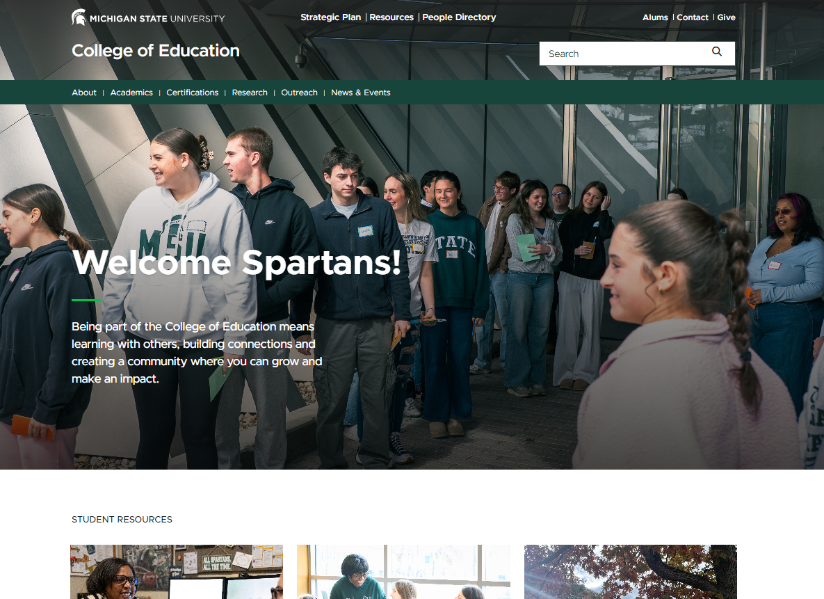
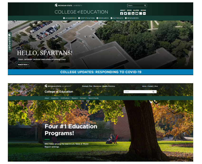
The first image displayed is the side by side comparison of the Wordpress website in 2022 (first image) and then the new Sitecore website in Fall 2025 (second image). The third image is an example of a program page showcasing the final program page format (Apply, Requirements, FAQ, Experiences, Resources, Contact) in the side menu.
No items found.
Related Works
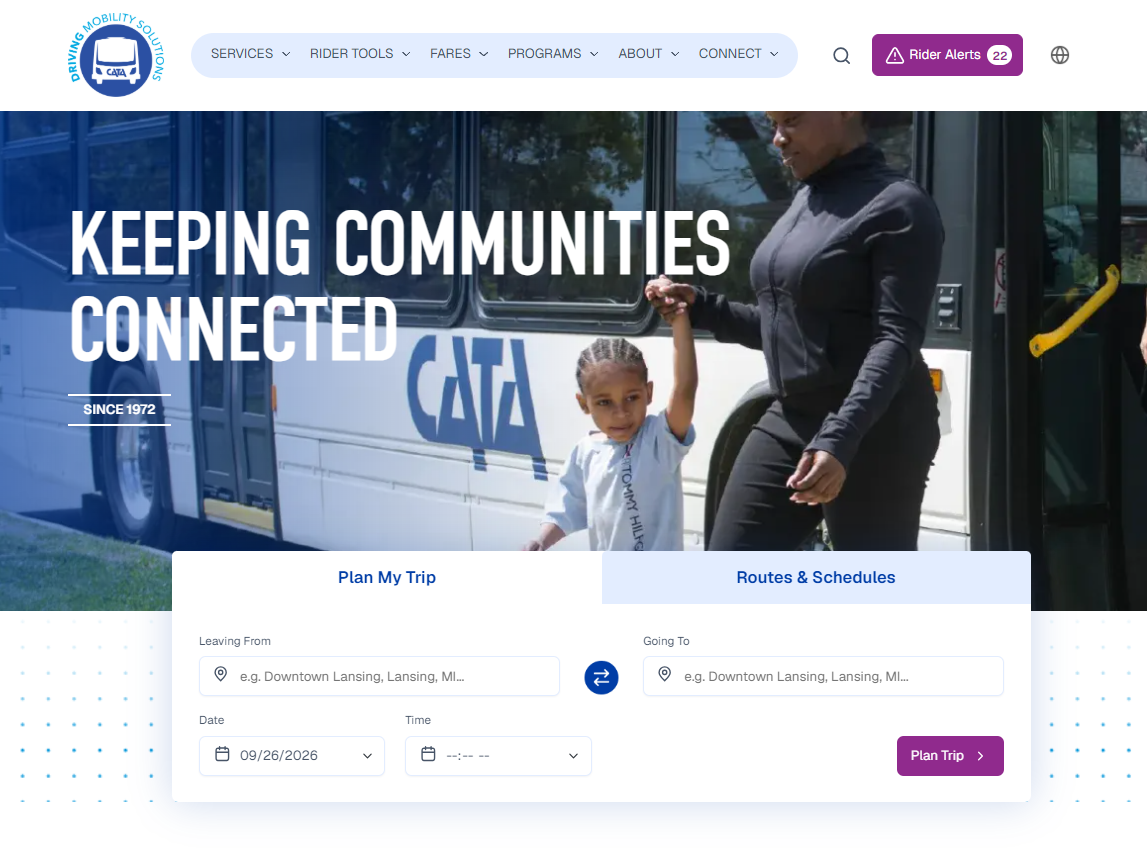
Capital Area Transportation Authority (CATA) Website
The CATA website is a central resource for transit around the Greater Lansing and surrounding areas (including MSU). Riders can plan trips, view routes and schedules, pay fares, receive service alerts and access the information and tools they need to navigate the public transportation system.
View Case Study
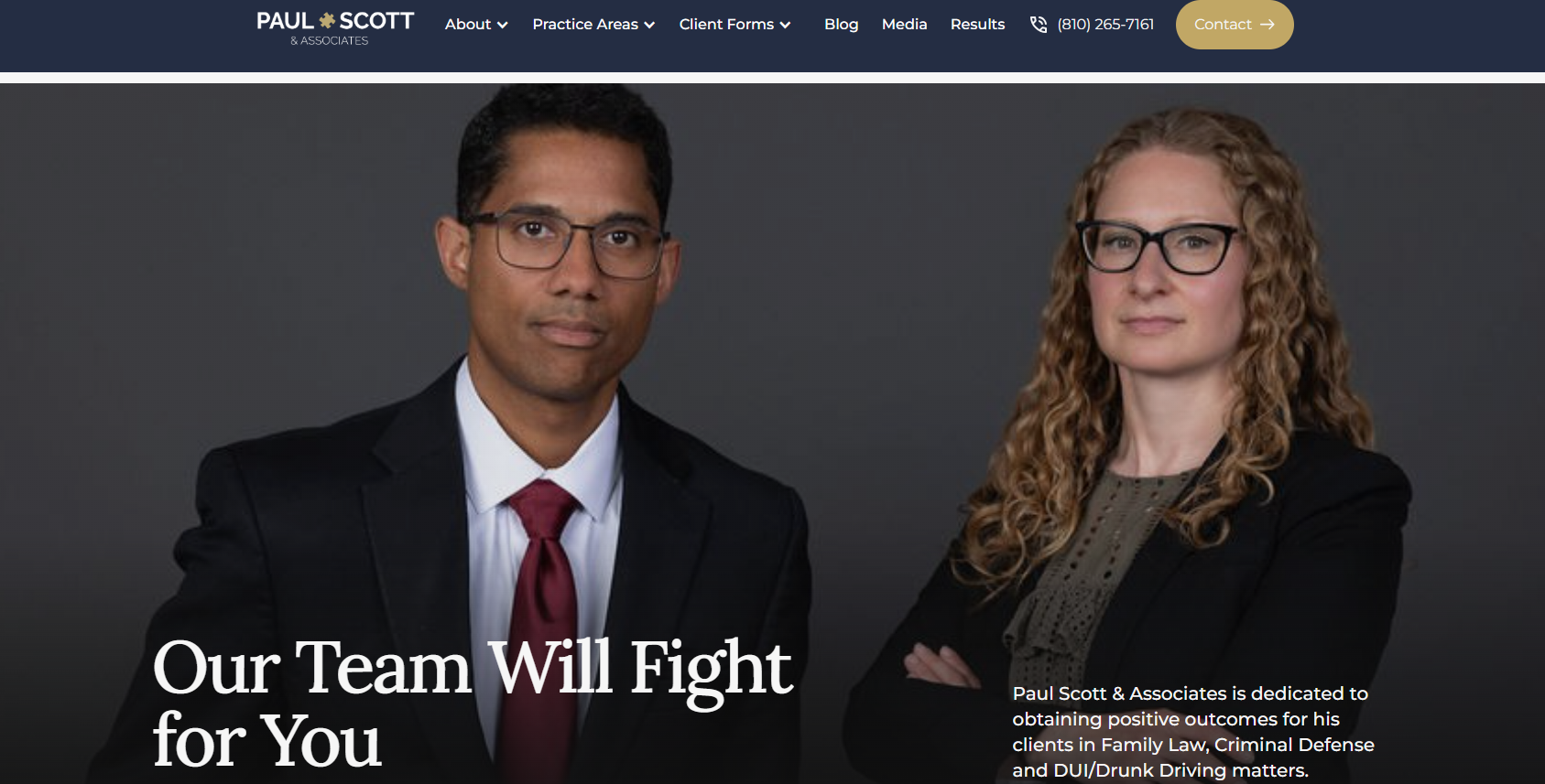
Paul Scott and Associates Website
Paul Scott and Associates is a Grand Blanc law firm that represents clients in family law, criminal defense, and DUI/drunk-driving cases. The website gives prospective clients a clear place to learn about their options, meet the attorneys, complete intake forms and get in touch with the firm.
View Case Study

