Project Details
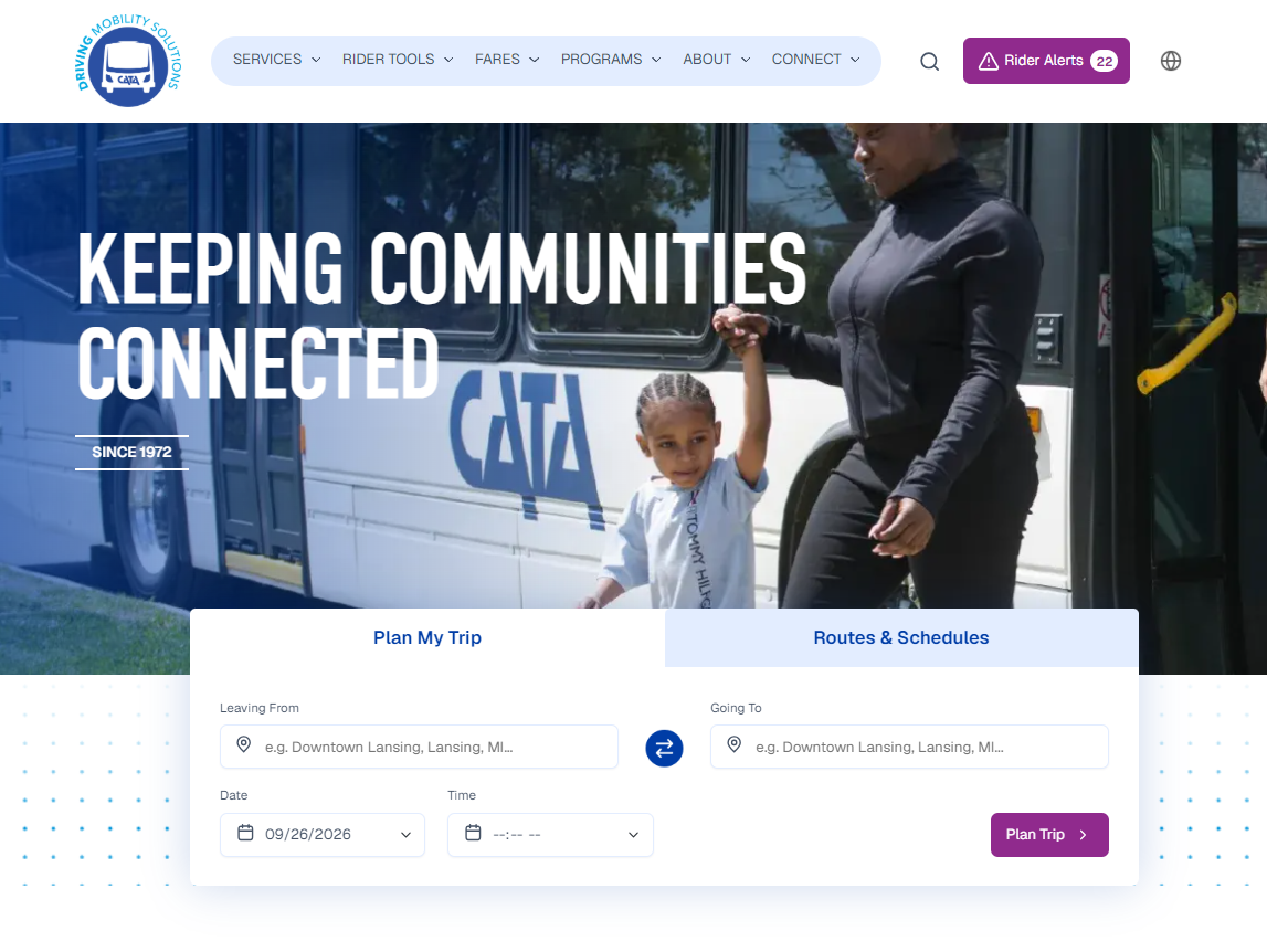
CATA.org is a public-transit website for Greater Lansing riders looking for routes, schedules, trip planning, bus stops, fares, rider alerts, accessibility services, and other time-sensitive information. The audience includes MSU students, older adults, people with disabilities and riders who may have limited access to current technology. CATA’s service area covers all of Ingham County and parts of Eaton and Clinton counties; the organization’s planning materials also documented 33 fixed routes and 7.63 million rides in fiscal year 2023.
When I joined CATA, the website was running on DNN and had not received a major redesign since 2016. It included more than 3,000 indexed pages, several custom modules, and third-party tools for functions such as trip planning, rider alerts, pass purchasing and paratransit services. The legacy DNN platform presented technical limitations as a web editor; its rigid content management capabilities made it difficult to output accessible ARIA attributes, hindering the website's ability to evolve alongside changing rider needs and modern web standards.
The project began as an accessibility and content-improvement effort, then developed into a plan for a larger website migration. I recommended Drupal as the preferred future CMS because it could better support accessible templates, clearer content-editor workflows, ongoing maintenance and a more manageable website. CATA selected Drupal after I left the organization, so this case study focuses on the work I completed to prepare the organization for that decision and for a future redesign.
The Problem
The existing website had overlapping content, unclear navigation, older page structures and accessibility issues that affected people trying to complete essential transit tasks. A usability study conducted by MSU UX graduate students from January through March 2024 identified recurring problems: participants struggled to tell bus-pass options apart, could not easily view the map behind the trip-planner overlay, had trouble locating nearby stops and found some transit terminology unclear. People seeking ADA accommodation information also had to navigate through multiple layers of content.
The project had to account for more than a visual refresh. CATA’s website supported complex, high-stakes services where riders may need accurate information quickly, including route changes, service alerts, pass purchases, trip planning and accessible transportation options. Replacing DNN also meant planning for existing custom modules, vendor-managed tools, internal hosting requirements and a future move toward cloud-based infrastructure.
Project Goal
The goal was to create an actionable path toward a website that was easier to use, easier to maintain and more accessible for the people who rely on CATA services.
The primary accessibility target was WCAG 2.1 AA, the standard most commonly expected for public-facing websites. I also identified WCAG AAA improvements that could be incorporated where practical, such as stronger contrast requirements, clearer language and additional multimedia accessibility measures. I chose this approach because treating AAA as an absolute requirement across every page and complex transit feature would not have been realistic; AA established the core standard while AAA created a direction for going further where the content and technology allowed.
Things I Did
Grew into CATA’s web accessibility resource
I started at CATA in June 2023 as a Digital Marketing Intern, supporting event staffing, social media, advertising and website updates. My previous MSU roles had given me experience with accessibility and web content, so when my manager identified a major need for more accessible digital content, I began taking on that work alongside my marketing responsibilities.
I started with the work that could make an immediate difference on the existing site:
- Remediated PDFs so riders could access essential information in a more usable format.
- Added alternative text to website images.
- Updated web content and addressed accessibility errors in the DNN site.
- Coordinated with a third-party accessibility vendor.
- Shared accessibility guidance for website content, documents, and social media across the department.
In September 2023, I was promoted to Digital Marketing Specialist so I could continue this work and begin preparing CATA for a future platform change. I became the department’s primary accessibility resource, which meant translating accessibility into practical guidance for people designing everyday content and not just designing because it is a requirement, designing because it creates a better experience for every person navigating a digital space.
Turned a 1,500-page audit into a migration plan
I created a foundational website audit covering 1,520 pages using Monsido, Screaming Frog, GA4, and Google Search Console. I tracked page-level accessibility issues, metadata gaps, broken links and images, readability, indexability, traffic, page views, bounce rate, PDFs, duplicate content, hidden pages, and notes for follow-up.
The audit found that the website’s problems were not limited to isolated accessibility errors. Many pages had missing metadata, weak heading structures, long or deeply nested URLs, duplicate content, old news and board-material archives, inaccessible documents, broken links, and content written above the reading level appropriate for quick transit information. For example, the audit documented high-traffic rider pages with missing metadata and accessibility issues, while some low-traffic or outdated pages remained indexed and added clutter to search results.
I did not recommend simply deleting every low-traffic page. A page might have had few views because it was hard to find, not because the information had no value. I built a content-phasing approach that called for reviewing hidden pages, validating decisions with internal stakeholders, preserving material that still had a legitimate future use, and using analytics, heatmaps, and usability findings to decide what to prioritize, revise, consolidate, archive, or remove.
Used usability findings to guide priorities
I created a summary of an MSU usability study that observed CATA and non-CATA riders completing tasks such as purchasing a pass, planning a trip, finding a bus stop and locating ADA accommodation information. The findings made the website’s issues more concrete:
- Riders had trouble understanding the difference between pass types and locating where to purchase a pass.
- The trip-planner overlay obscured the map, making route planning frustrating.
- Visitors had difficulty finding nearby stops.
- Some CATA-specific terms and labels were unclear.
- ADA accommodation information required visitors to move through multiple layers of content.
I used those findings, along with analytics and audit data, to recommend a future information architecture centered on the tasks riders were already trying to complete. This included clearer pass descriptions, more visible pathways to purchasing passes, a more understandable trip-planning and map experience, better-organized route information, and a more direct path to accessibility services. I also proposed reducing dense copy, adding visual support where it helped explain routes or services, and aiming for a sixth- to seventh-grade reading level for web content.
Defined a practical accessibility standard
I wrote WCAG A, AA, and AAA recommendation documents to clarify what the redesign should require. The key decision was to use WCAG 2.1 AA as the baseline and incorporate AAA requirements when they were feasible for the content or feature.
That distinction mattered. AA was the realistic standard for the full public website, while AAA included useful aspirational improvements such as enhanced contrast, sign-language interpretation for video, clearer language, and additional multimedia support. I did not treat AAA as a checkbox that could be applied evenly to every page, form, third-party integration, or transit tool. Instead, I used it to identify ways CATA could go further for riders when the technology and content allowed.
Built the materials for a future redesign
I created the core documentation CATA needed to move from a broad desire for a better website to a defined vendor and migration process. While I received limited help reviewing some URLs in the page trackers, I authored the planning materials and carried most of the work while my manager was on maternity leave.
Key deliverables included:
- A website project brief that defined the audience, constraints, objectives, phases, success measures, and estimated resources.
- A website RFP and scope of work for selecting a redesign vendor.
- A foundational web audit, hidden-page inventory, duplicate-content review, and page tracker.
- A content-phasing plan for reviewing, consolidating, archiving, and restructuring content.
- A cloud-hosting proposal to support a more stable and maintainable environment.
- A usability-study summary that translated observed rider challenges into redesign priorities.
- WCAG A, AA, and AAA recommendations for the redesign and future content practices.
I recommended Drupal as the preferred CMS because it could better support accessible templates, clearer publishing workflows, ongoing maintenance, and content governance than the existing DNN environment. CATA chose Drupal after I left, so I describe this as a recommendation and planning contribution rather than crediting myself with the final platform selection.
Documentating my work
I created training videos explaining website updates, navigation and the broader web strategy for the person who would take over the website work and for future interns working in within the old CMS.
The project also shaped how I approached my next role. At CATA, I learned how to define a website problem before a migration begins: document the current site, understand what riders struggle to do, set realistic accessibility requirements, identify technical constraints and give a future vendor enough information to make informed decisions. I carried that foundation into the College of Education’s WordPress-to-Sitecore migration, where I later worked on the implementation side of a similar process.
Outcome
CATA later launched its website in Drupal after I moved into my role at MSU. While I was not part of the final implementation, the planning materials, accessibility recommendations, audit findings and migration documentation I created gave the team a foundation for the work ahead.
The only documented live metric from my broader Digital Marketing Specialist role is a 30% increase in user traffic associated with work alongside three digital-marketing vendors on website and social platforms for events and campaigns. I would present that separately from the redesign case study unless you can connect it directly to a specific web or campaign initiative.
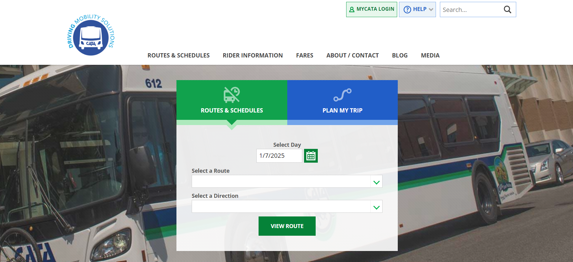
Below is a screenshot of what the CATA website looked like prior to the migration to Drupal. To view more of the materials mentioned, such as the project brief and audit, view the CATA Website Project Google Drive folder. Some written materials in this folder were developed with limited assistance from ChatGPT to help organize and clarify my original notes and ideas. The project analysis, recommendations and decisions were my own.
No items found.
Related Works
MSU College of Education Website
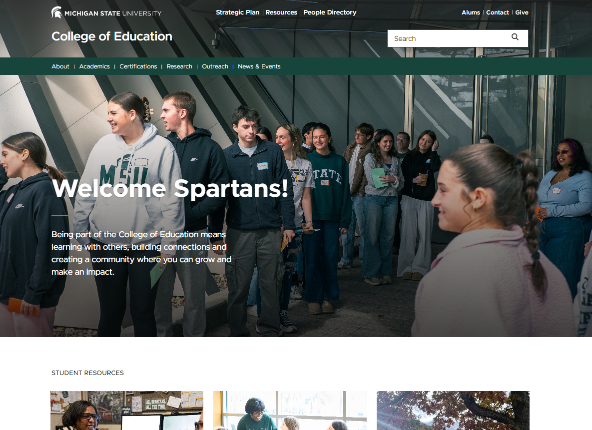
The MSU College of Education website serves as a central resource for current and prospective students, faculty and staff with academic programs, research, events, resources and more.
View Case Study
Paul Scott and Associates Website
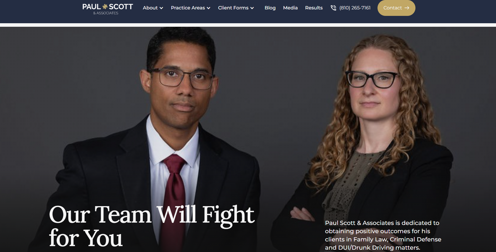
Paul Scott and Associates is a Grand Blanc law firm that represents clients in family law, criminal defense, and DUI/drunk-driving cases. The website gives prospective clients a clear place to learn about their options, meet the attorneys, complete intake forms and get in touch with the firm.
View Case Study

